My design for listing events goes something likes this -
Normal listing (even when you're not registered)
It showcases the banners of events. I think it's better this way cause I know how many puts a lot of effort to their banners so it's better to display it than just a simple list. Per date could fit around 5-6 banners of events then it goes down (same like the front page of SureScene).
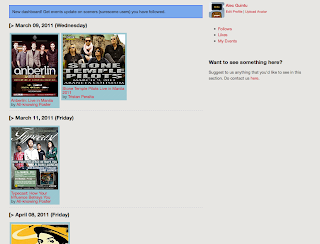
Now, I did this on the dashboard but my problem is when the events gets a lot it won't fit better than the previous img because of the side panel on the right. See -
Dashboard (where you get updates of event organizers you "follow")
Now I am trying to redesign the dashboard for this and it came out like this-
Dashboard (where you get updates of event organizers you "follow")
When you click on banner, it blows up like below
So now I have kinda fixed it, but it brings me back to a normal listing where the banner is not so visible(well it still displays the banners but in thumbnail and one-click view)...
I also have a few arguments more like cause they are of two different purpose, one is for the normal listing (search/normal view) and the other is for dashboard (where you get updates and stuff). So, What do you guys think I should implement?


No comments:
Post a Comment